Customization

Websites
The Front End Portal Website section customizes the appearance of the front-end portal that users interact with. The Admin Website section customizes the appearance of the upload and administration site. Both sections have similar options, though as noted below, some options apply only to one of the sites.
The following areas can be configured:
-
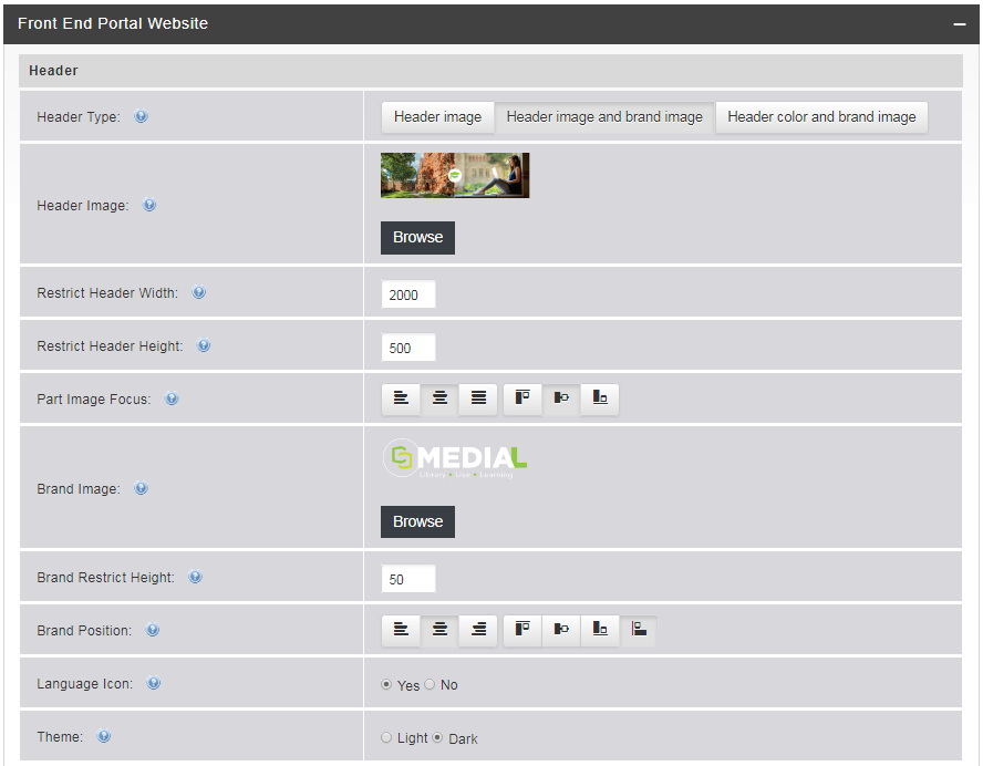
Header Type – There are three options for the header on the admin site:
- Header image – Allows you to select an image to be used for the header.
- Header image and brand image – Uses an image for the header, with another image overlaid onto it.
- Header color and brand image – Uses a color for the header, witha brand image overlaid onto it
-
Header Image – If you chose a header image option, click the Browse button to select the image.
The recommended dimensions for a full-size header image is 1058x126 pixels.
- Header Background Color – If you chose the header color option, click the palette icon to select the color. You can use the palette controls to set a color, or you can enter a color value in Hexadecimal, RGB, or HSB format.
- Restrict Header Width and Restrict Header Height – These fields allow you to set the header width and height to change how much of the image can be seen in the header. Enter values in pixels.
- Part Image Focus – Use this to set the focus on the header image. The first three icons can be used to set the focus on the left, center, or right side of the image. The next three icons will set the focus on either the top, middle, or bottom of the image.
- Brand Image – If you chose a header with a brand image option, click Browse to upload the brand image. This should typically be a small version of your organization logo. It will appear over the top of the header image.
- Brand Restrict Height – Restricts the height of the brand image within the header image.
- Brand Position – Sets the position of the brand image within the header. The first three choices position the image on the left, center, or right side of the header image. The next three icons position the image at the top, middle, or bottom of the header image.
- Language Icon– Front End Portal only. Sets whether or not the language icon is displayed.
- Theme – Front End Portal only. Sets the theme to either light or dark. The default setting for MEDIAL is the dark theme.
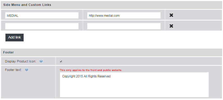
- Custom Links – Front End Portal only. Custom links can be added to the side menu in the front-end portal. Enter the name for the link to display. Then enter the URL of the site for the link. Click Add Link to add a new row when the initial two rows have been used.
- Footer – Front End Portal only. By default, the media icon is displayed in the footer. Unchecking the box removes it. The footer text applies only to the front-end portal and can be customized in the text box.
-
Background Image – Admin Site only. A background image can be set to show either side of the MEDIAL admin site. The recommended size for the image is 1680 x 1050 pixels.
-
Background Color – Admin Site only. The background color shows around the background image. You can set a color only if you have uploaded a background image. Click the palette icon to select the color. You can use the palette controls to set a color, or you can enter a color value in Hexadecimal, RGB, or HSB format.
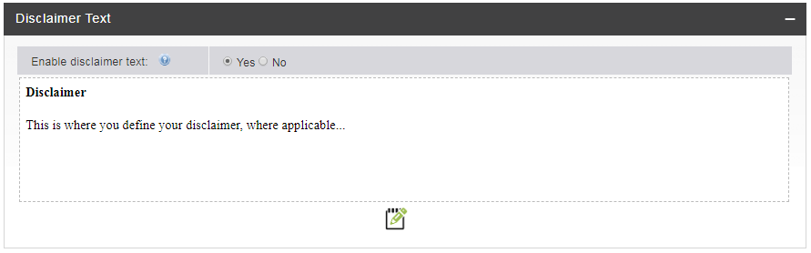
Disclaimer Text
Enabling the disclaimer allows you to write a disclaimer in the text editor. When enabled, users see the disclaimer in the upload wizard, and have to agree to the terms in it before they can continue with the upload. Click the Edit icon to change the text.
Email Notification Text
Here you can modify the text of emails sent out to users and administrators on these events:
- Successful clip upload
- Failed clip upload
- Offensive content notification
- Reported comment email
- Video editing email
- Captions editing email
You can use predefined tags to insert specific values into the emails.
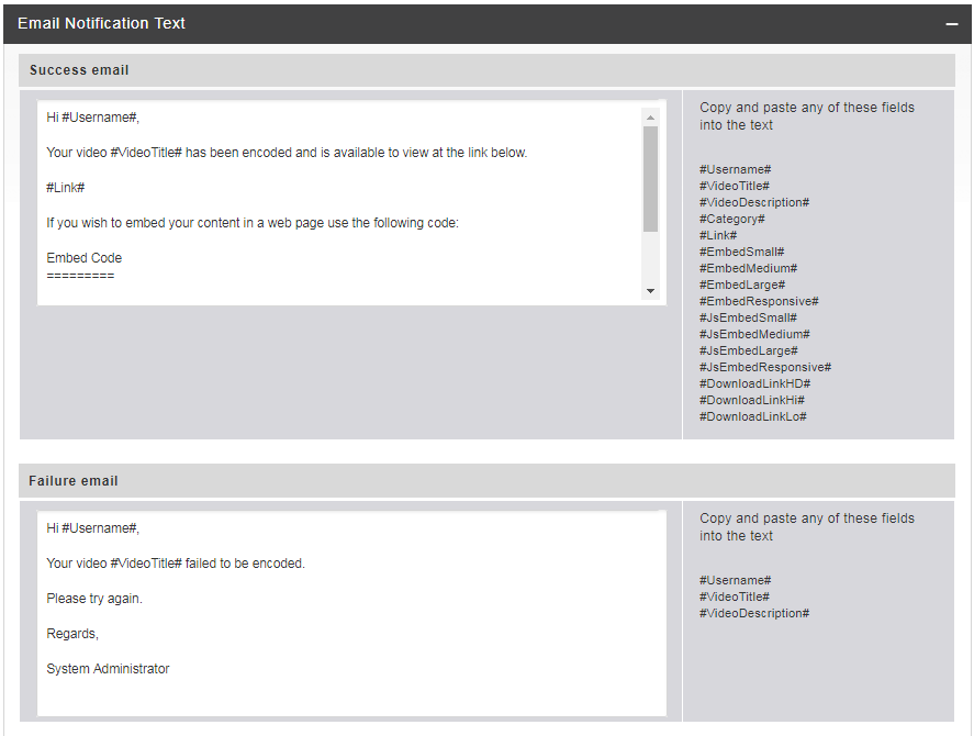
Predefined Email Tags
The tags that can be used in the email are displayed next to the text box.
|
Field |
Pixel Size |
Value |
|---|---|---|
|
#Username# |
n/a |
User's log-in name. |
|
#VideoTitle# |
n/a |
User-provided title. |
|
#VideoDescription# |
n/a |
Video description. |
|
#Category# |
n/a |
Category the clip was uploaded to. |
|
#Link# |
n/a |
URL to the playback page of the clip. |
|
#EmbedSmall# |
320x260 |
The iframe embed code for the clip with a small player (see the tip below). |
|
#EmbedMedium# |
640x385 |
The iframe code for embedding with a larger player. |
|
#EmbedLarge# |
835x505 |
The iframe embed code for a large player. |
|
#EmbedResponsive# |
n/a |
The iframe embed code for a fully responsive player. |
|
#JSEmbedSmall# |
320x260 |
Javascript embed code to place the player in a web page at the smallest size. |
|
#JSEmbedMedium# |
640x385 |
Javascript embed code with the player at a larger size. |
|
#JSEmbedLarge# |
835x505 |
Javascript embed code for the largest player. |
|
#DownloadLinkHi# |
n/a |
Link to the high-quality version of the download file. |
|
#DownloadLinkLo# |
n/a |
Link to the low-quality version of the download file. |
|
#Subject# |
n/a |
Subject of the offensive content message. |
|
#Message# |
n/a |
Reason the user supplied for reporting the clip. |
The iframe embed code options are recommended for embed code to work across non-Flash enabled devices such as iPad/iPhone.
LTI Text
This is the text displayed when users use the LTI plugin in the virtual learning environment.

The following messages can be changed:
- Logon/Register Message – Text that is displayed when the user first uses the learning tool.
- Logon/Register Prompt – Change this according to how the user should proceed with the log-in or registration depending on how the plugin is configured.
- File Uploaded Result Message – This message is displayed on the exit page once a file has been uploaded.
- File Selected Result Message – This is displayed on the exit page when a file has been selected in the wizard and the process has been completed.
- Exit Message 1 – This message is shown on the exit screen if the upload process was initiated by a rich text editor button in the learning environment.
- Exit Message 2 – This is the message that is displayed on the exit screen if the upload process was initiated using a button that is not in the rich text editor in the learning environment.
Portal Login Text
The portal login text can be changed so that users are presented with a custom login page when they navigate to the MEDIAL portal to log in.
There are three options for this:
- Default Login URL
- MEDIALecture Login URL
- Custom Login URL
The below image shows these sections which can be edited to change what the user sees at the login screen. The first one for the default login screen will determine what a user sees when they directly access the portal. The second one determines what a user will see if they launch MEDIALecture from the desktop (when MEDIALecture has been installed using the MSI and the MEDIAL URL is specified as the target) when they are taken to the login page. This may include instructions on how to start using MEDIALecture to start a new recording. The last section is for a custom URL, should one be being used somewhere. The name 'custom' can be changed to meet any particular requirements.
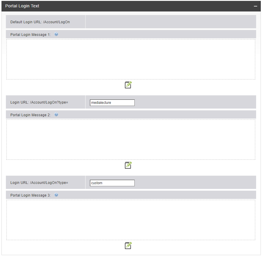
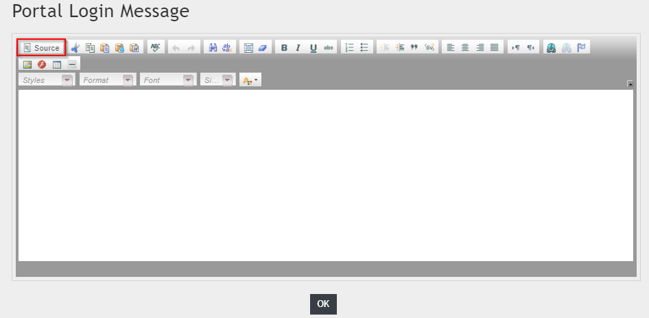
To edit a section click on the pencil icon below the blank space. Enter in any text in the text editor box, or to add in HTML containing text and images click on the 'source' button. Once completed click on the OK button to close the text editor window. Click on Save at the bottom of the page to save any changes.
MEDIALecture
The MEDIALecture completion screen can be modified to suit your environment. The MEDIALecture completion screen is the final screen displayed once a recording has been completed and submitted using MEDIALecture.
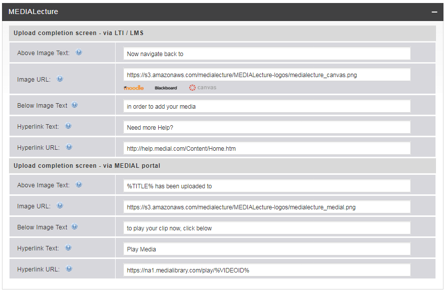
The following options can be changed:
Upload completion screen - via LTI/LMS
When MEDIALecture is launched through the LMS the following customization options can be set for the completion screen:
- Above Image Text - This is the text that will appear above the LMS image.
- Image URL - The URL to the image that appears for the LMS on the MEDIALecture completion screen. If a custom image is required this can be manually changed to point to the hosted image. If your LMS is Moodle, Blackboard or Canvas, click on one of the buttons below the Image URL field to change the image accordingly.
- Below image text - This is the text that appears below the LMS image.
- Hyperlink Text - The text that appears for the hyperlink which points to the help area.
- Hyperlink URL - A link to the help area. This points to the MEDIAL documentation site by default, but can be changed to point to a custom help/support site.
Upload completion screen - via MEDIAL portal
When MEDIALecture is launched through the MEDIAL portal the following customization options can be set for the completion screen:
- Above Image Text - This is the text that will appear above the MEDIAL image.
- Image URL - The URL to the image that appears on the MEDIALecture completion screen. If a custom image is required this can be manually changed to point to the hosted image. The default image is a MEDIAL one.
- Below image text - This is the text that appears below the image.
- Hyperlink Text - The text that appears for the hyperlink which points to the recording in MEDIAL.
- Hyperlink URL - A link to the recording in MEDIAL. It is recommended to leave this value set to the default.

|
©2025 Streaming Ltd |   |